
Exploring Education and Poverty in Tableau
July 4, 2021
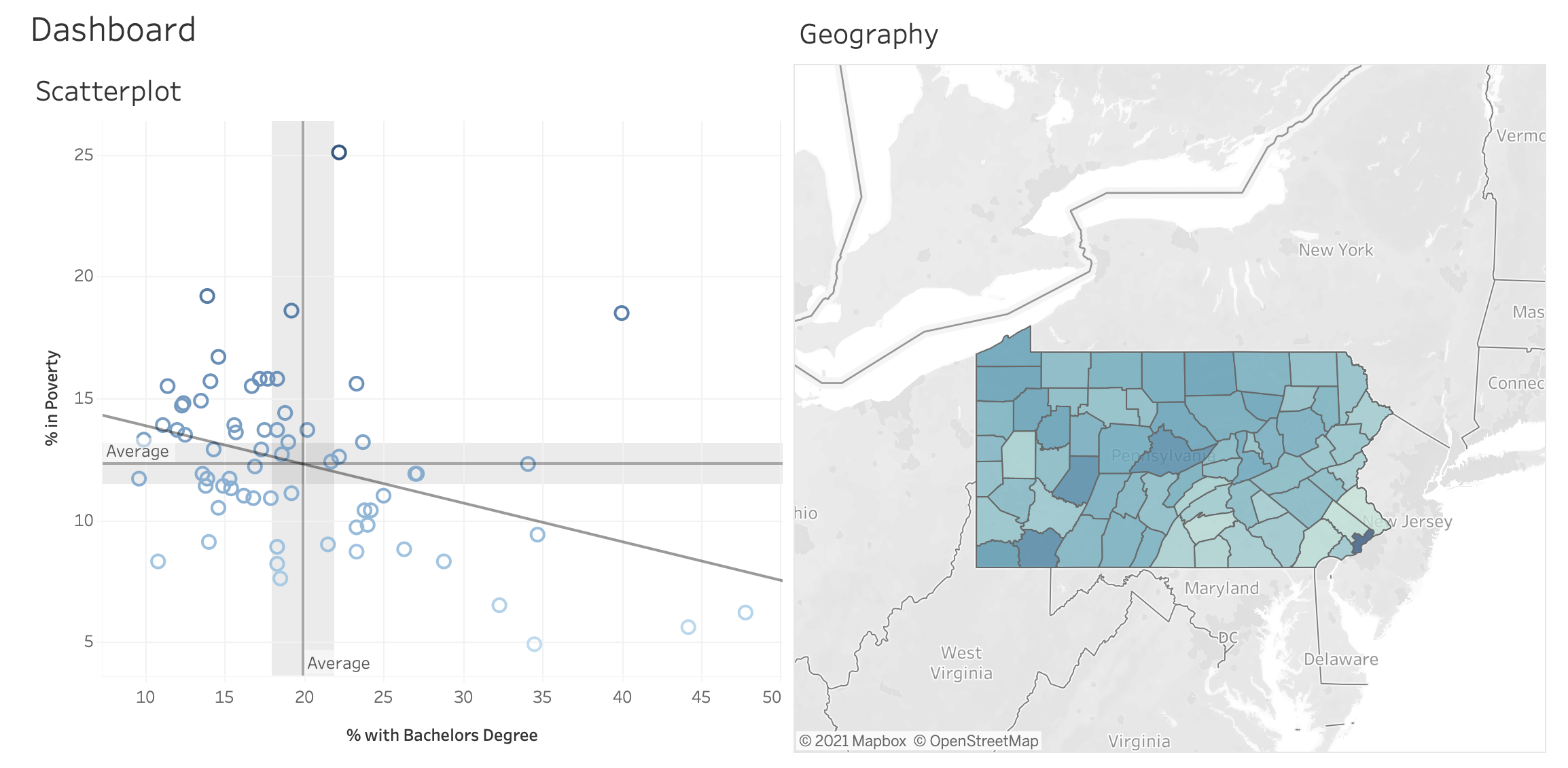
Below is a screenshot of Tableau dashboard I created while taking CS 416 at the University of Illinois at Urbana-Champaign. It shows the relationship between poverty and education in the counties of Pennsylvania. You can see the general trend is negative. In other words, as more and more people become educated, the respective poverty level of their counties decreases. You can visit and interact with the dashboard on the Tableau page on my website. The following is some question and answer about my Tableau app.
Q. What is the URL for the submitted dashboard? https://pmagunia.com/tableau.html
Q. What is one question that the dashboard can answer by utilizing two or more simultaneously displayed charts? What is the answer? How do these two charts indicate the answer?”What is the relationship between education and poverty in Pennsylvania and which geographic regions are most representative of this relationship?”From the first chart, we can see an inverse relationship between education and poverty. In other words, as more people are educated, there is a tendency for poverty to decrease. This is indicated by the negative slope of the trend line. We see there is an outlier, Centre county which has above average poverty and education rates. This could be explained by the fact, that Penn State, a large public university dominates the local economy is located there. From the map, we can see where the most poverty occurs in Pennsylvania, and that is Philadelphia county with a poverty rate of 25%. The lowest poverty rate is Bucks county. We can see from the map, both of these counties are located in southeastern Pennsylvania. Chester and Montgomery counties are located close the the trend line and most strongly represent the inverse relationship between education and poverty. In other words, they both have high education rates and low poverty. We would expect counties in Quadrant II (upper left) and Quadrant IV (lower right) to most strongly represent this relationship. There are a number of counties which fall exactly on the trend line such as Jefferson, Mifflin and Bedford counties.The two charts are connected. When a user hovers on a county in Pennsylvania, its point on the scatterplot is highlighted. The converse is also true: when a user hovers on a point in the scatterplot, the geographic location on the map is highlighted. We can see Chester, Montgomery, Bucks, and Philadelphia counties are all located in southeastern Pennsylvania.
Q. How does the layout of these charts promote visual understanding of the data across multiple charts? Make sure your explanation describes color consistentcy, alignment and any other ways the layout improves visual understanding.The maximum for education (% Bachelors) is 48% which is the statistic for Chester county. Instead of setting the x-axis domain to be (0,100) I used (0,48%). This allows values to be spread out more and prevent crowding of points. Likewise for poverty which plotted on the y-axis.On the right, the entire US map is not shown and instead focuses just on Pennsylvania. This makes it easier to locate counties with the mouse. On the map, the continuous variable poverty has been color-coded to various shades of blue which shows the severity of poverity in the county. This shade of blue is consistent with the color of points in the scatterplot.
Q. Indicate which chart is the “first” chart. Then justify the choice of this chart type, its axes and marks based on the data variables it shows.The “first” chart is the scatterplot on the left. Since both variables (education and poverty) are continous, it makes sense to have the relationship displayed in a scatterplot. Color Marks are chosen for poverty, the dependent variable which is displayed on the y-axis. Points with greater rates of poverty are shaded a darker hue of blue.
Q. Indicate which chart is the “second” chart. Then justify the choice of this chart type, its axes and marks based on the data variables it shows.The “second” chart is the map of Pennsylvania on the right. Since residents of Pennsylvania may want to know the statistics of their county in relation to other counties in Pennsylvania, they can easily hover to their hometown on the map of Pennsylvania to have their point highlighted in the scatterplot. It would not be easy to find your hometown county on the scatterplot if you did not have the map to the right.Color Marks highlight the dependent variable, poverty, on the map in different shades of blue with counties with the most poverty being darker. Education is chosen for a detail mark since it is the independent variable. The axes on the map is longitude and latitude centered for Pennslyvania.
Q. How does your dashboard support cross-filtering between these two charts?The map and scatterplot are “wired-up” to each other in two ways.When you select a rectanglar area on the scatterplot with your mouse, the map automatically cross-filters the counties you have just selected.Also, when you hover on a point in the scatterplot, the geographic location of the county is highlighted on the map, and conversely, when you hover on a county in Pennsylvania, the point on the scatterplot is highlighted.
Q. How does your dashboard provide details on demand?When a user hovers on a county on the map or point on the scatterplot, details-on-demand are provided in a mouse tooltip.
